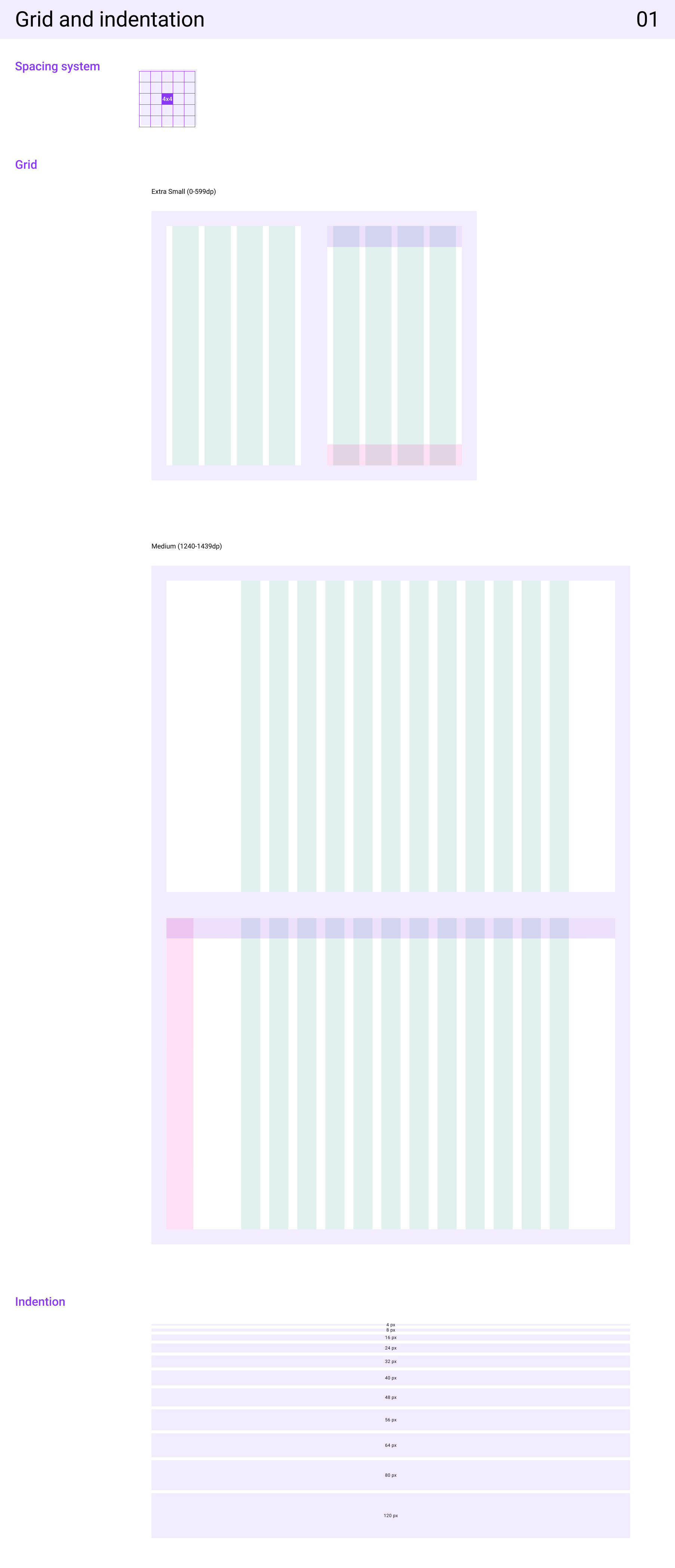
Grid and Indentation
The grid and indentation system establishes a clear layout structure to ensure visual balance and alignment across all interfaces. It defines consistent column grids, spacing units, and margins that guide content placement and responsiveness. This foundation helps maintain hierarchy, readability, and a cohesive visual rhythm throughout the product.
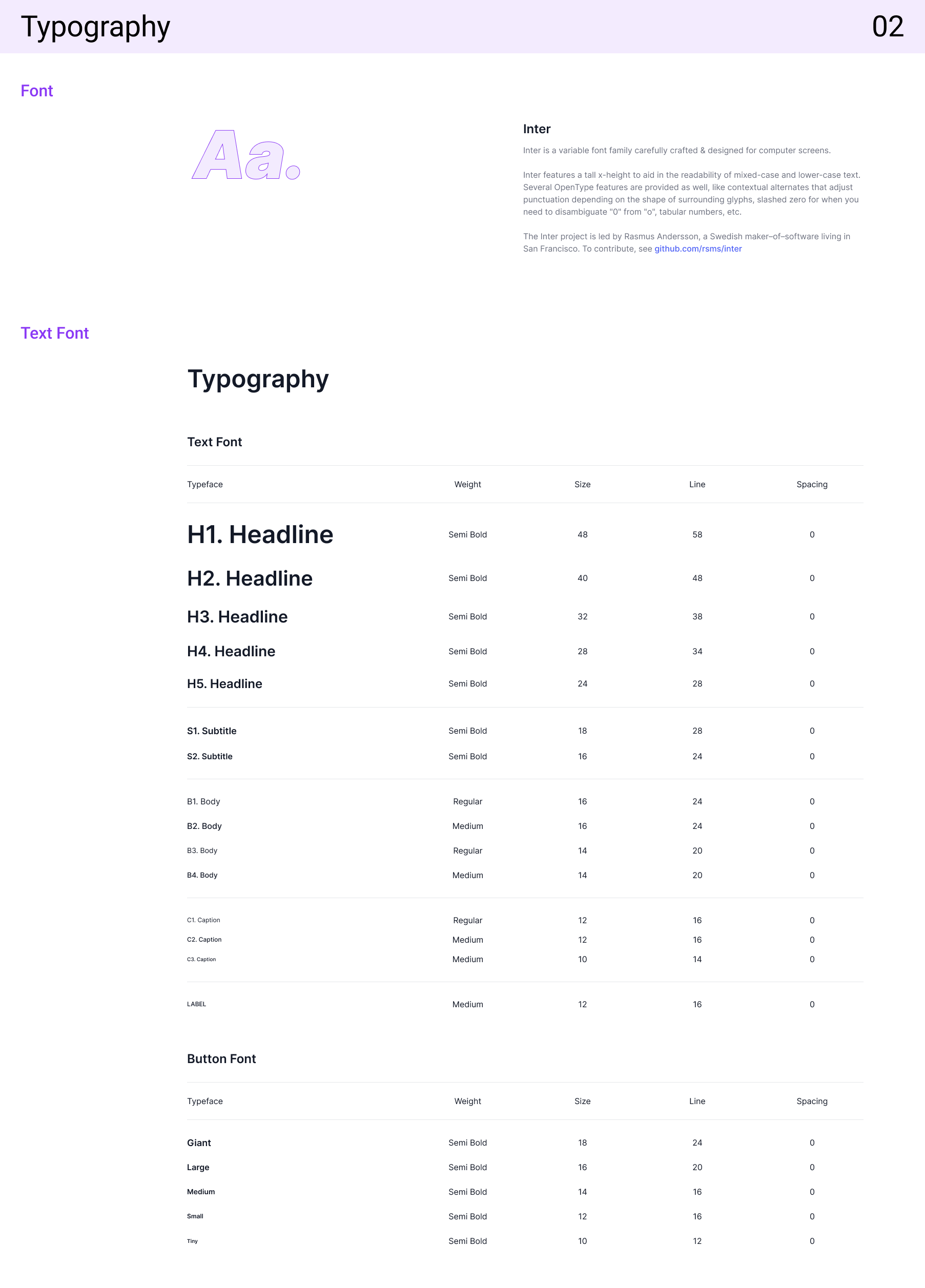
Typography
The typography system defines the font styles, sizes, and hierarchy used across the product to ensure clarity and brand consistency. It includes guidelines for headings, body text, captions, and interactive elements, maintaining readability across devices while reinforcing a unified visual identity.
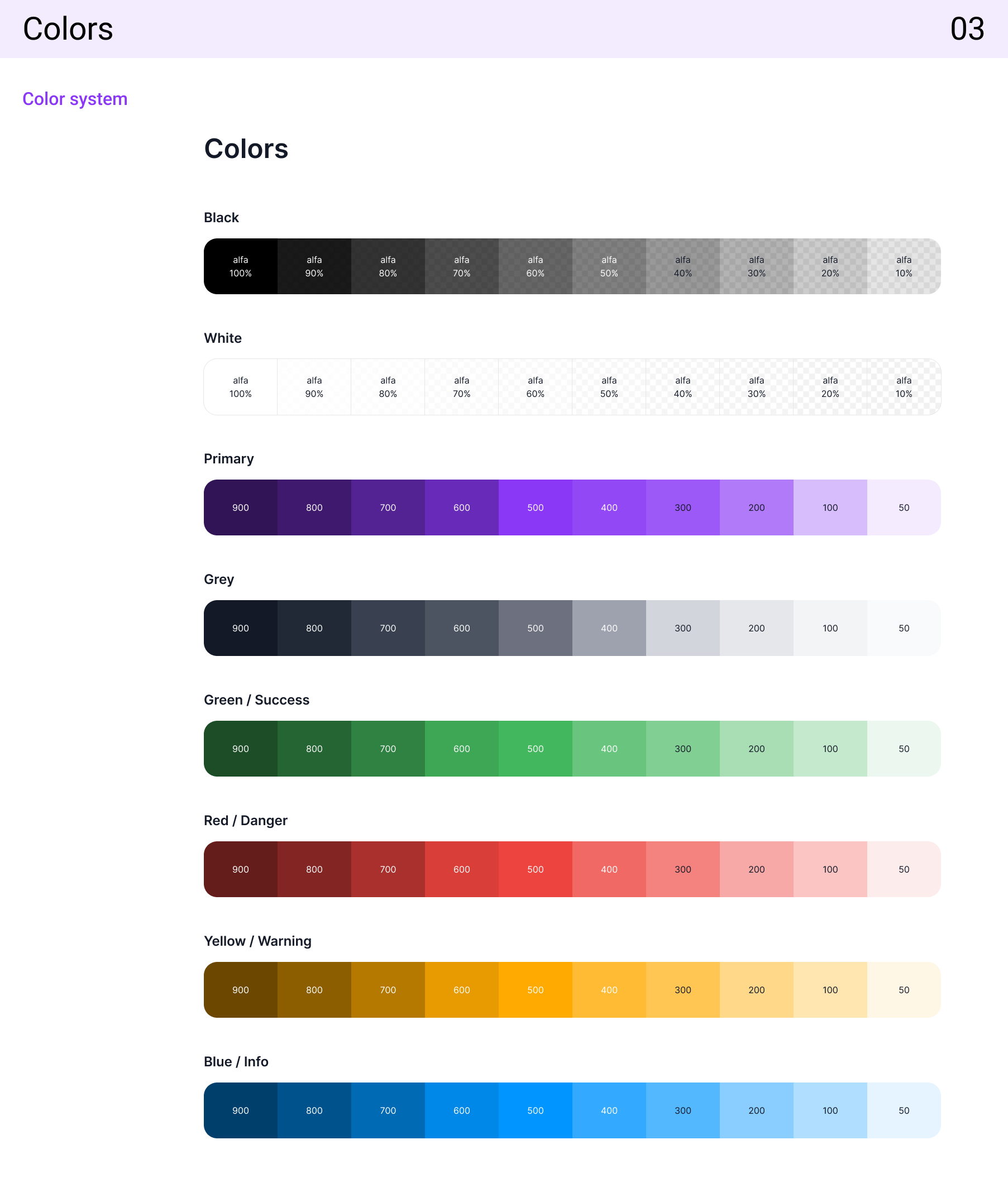
Colours
The colour system defines the primary, secondary, and neutral palettes used across the product to create a cohesive and accessible visual experience. It establishes roles for each colour—such as background, text, borders, and states (success, error, warning)—ensuring consistency, contrast, and alignment with the brand’s identity.
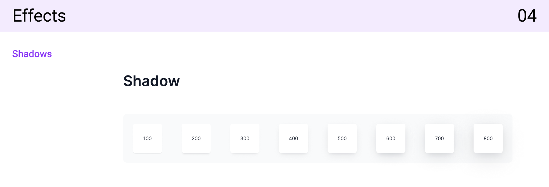
Effects
The effects system defines the use of shadows, blurs, and overlays to create depth, focus, and visual hierarchy across interfaces. It ensures consistent elevation levels for components, enhances interactivity through hover and active states, and contributes to a clean, modern aesthetic that improves user experience.
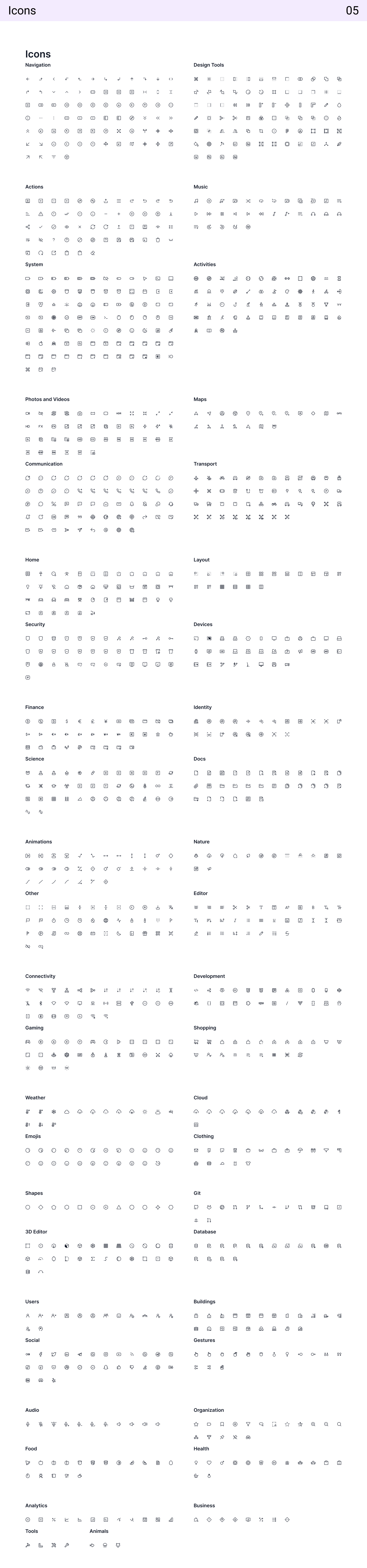
Icons
The icon system provides a consistent set of symbols that enhance communication and improve usability across the product. Each icon is designed on a uniform grid with balanced stroke weights and clear visual meaning, ensuring scalability and recognizability. The system covers functional icons, status indicators, and navigation symbols that align with the overall design language.
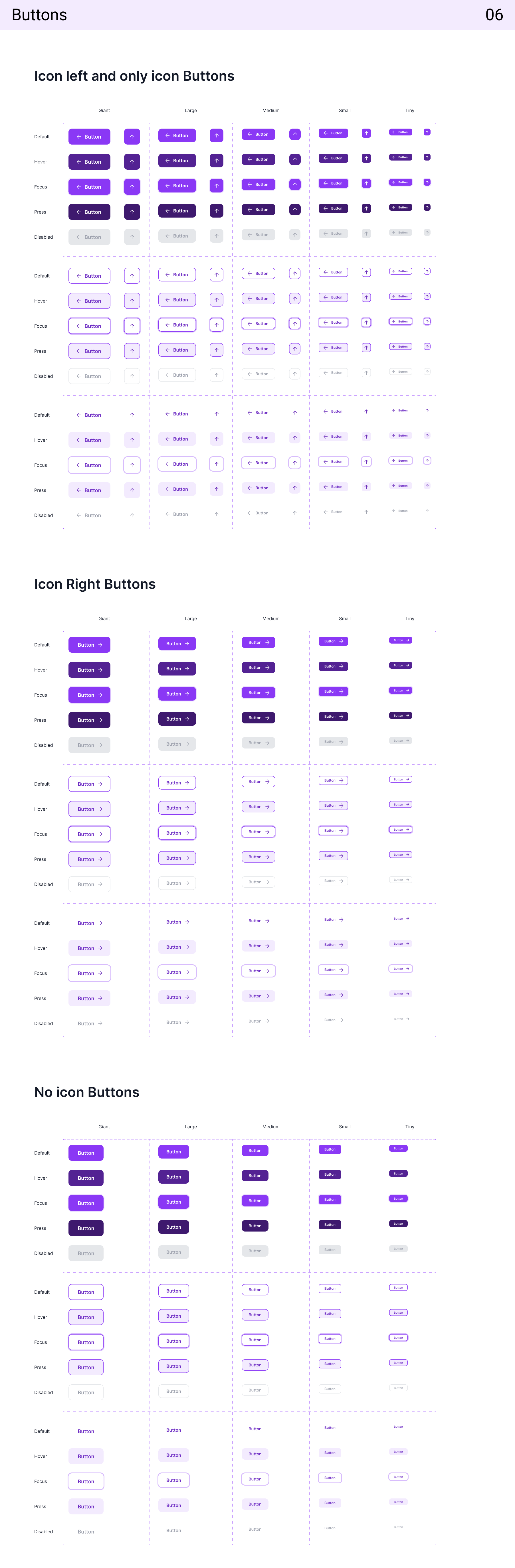
Buttons
The button system defines the visual styles, hierarchy, and interaction states for all call-to-action elements. It includes primary, secondary, and tertiary buttons with consistent sizing, padding, and corner radius. Each state—default, hover, active, and disabled—is clearly defined to guide user interaction and ensure accessibility across devices.
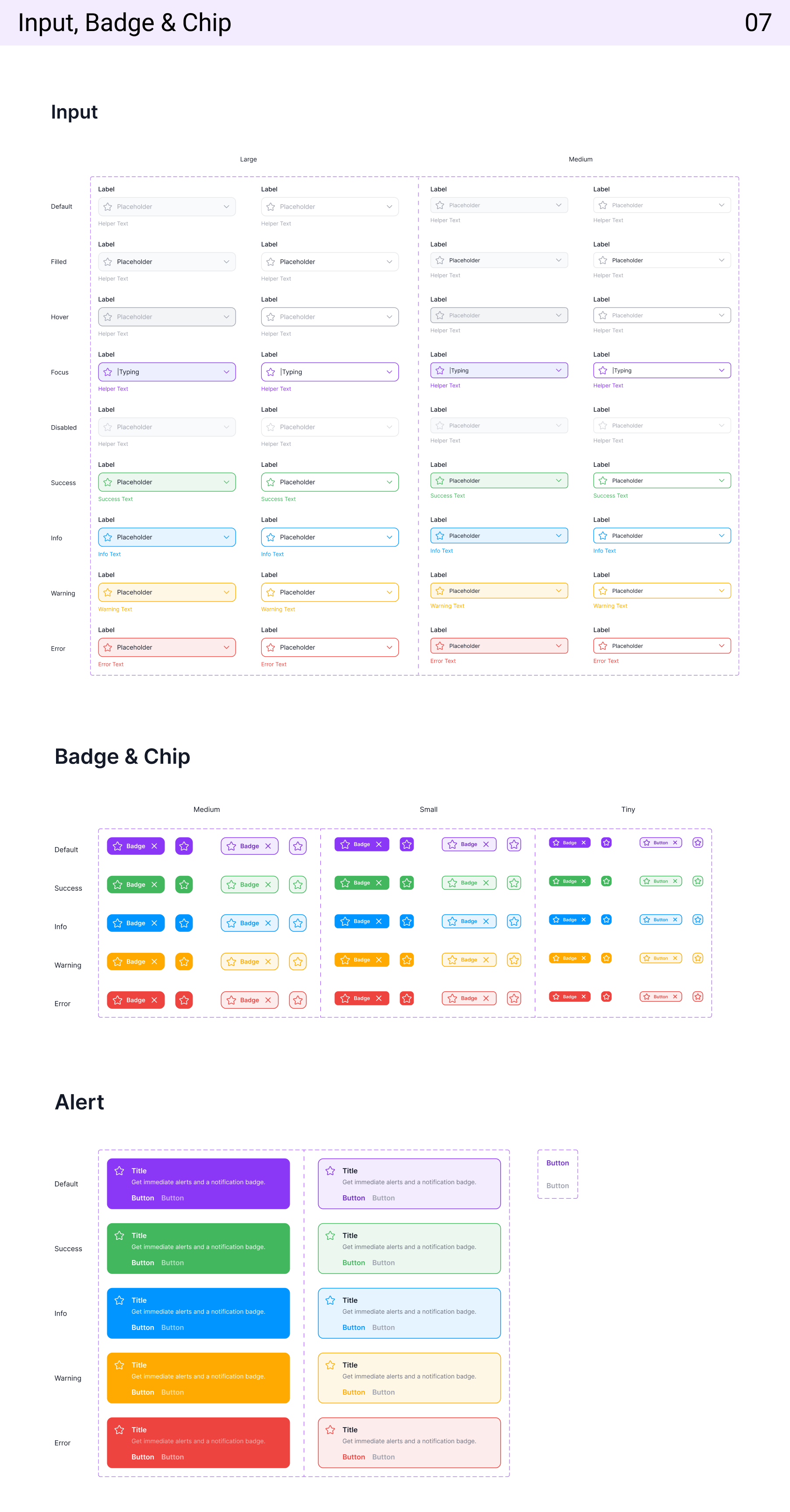
Input
The input system establishes standardized fields for data entry, ensuring clarity, usability, and accessibility. It includes variations such as text fields, dropdowns, and text areas with defined states—default, focused, filled, error, and disabled—maintaining consistency and ease of interaction across forms.
Badge & Chip
The badge and chip system provides compact UI elements for displaying status, categories, or user selections. Badges are used to highlight notifications or counts, while chips represent tags, filters, or user inputs. Both follow consistent color usage, typography, and spacing to maintain visual harmony across components.
Alert
The alert system communicates important feedback such as success, error, warning, or informational messages. Each alert type uses clear iconography, color coding, and concise text to ensure messages are easily noticeable and accessible, improving the user’s ability to respond to system events effectively.
Select Controls
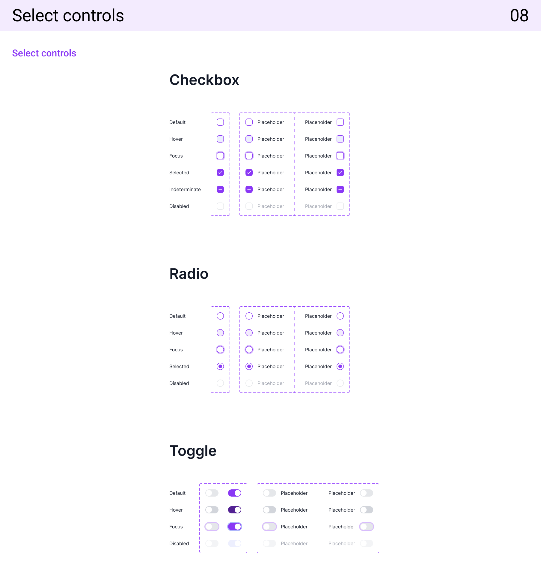
The select controls system defines the design and behavior of dropdowns, checkboxes, radio buttons, and toggles used for user selections. It ensures clear visual states—default, hover, selected, and disabled—while maintaining accessibility and responsiveness. Consistent spacing, icon alignment, and label hierarchy make interactions intuitive and visually cohesive across all selection elements.
Dropdown
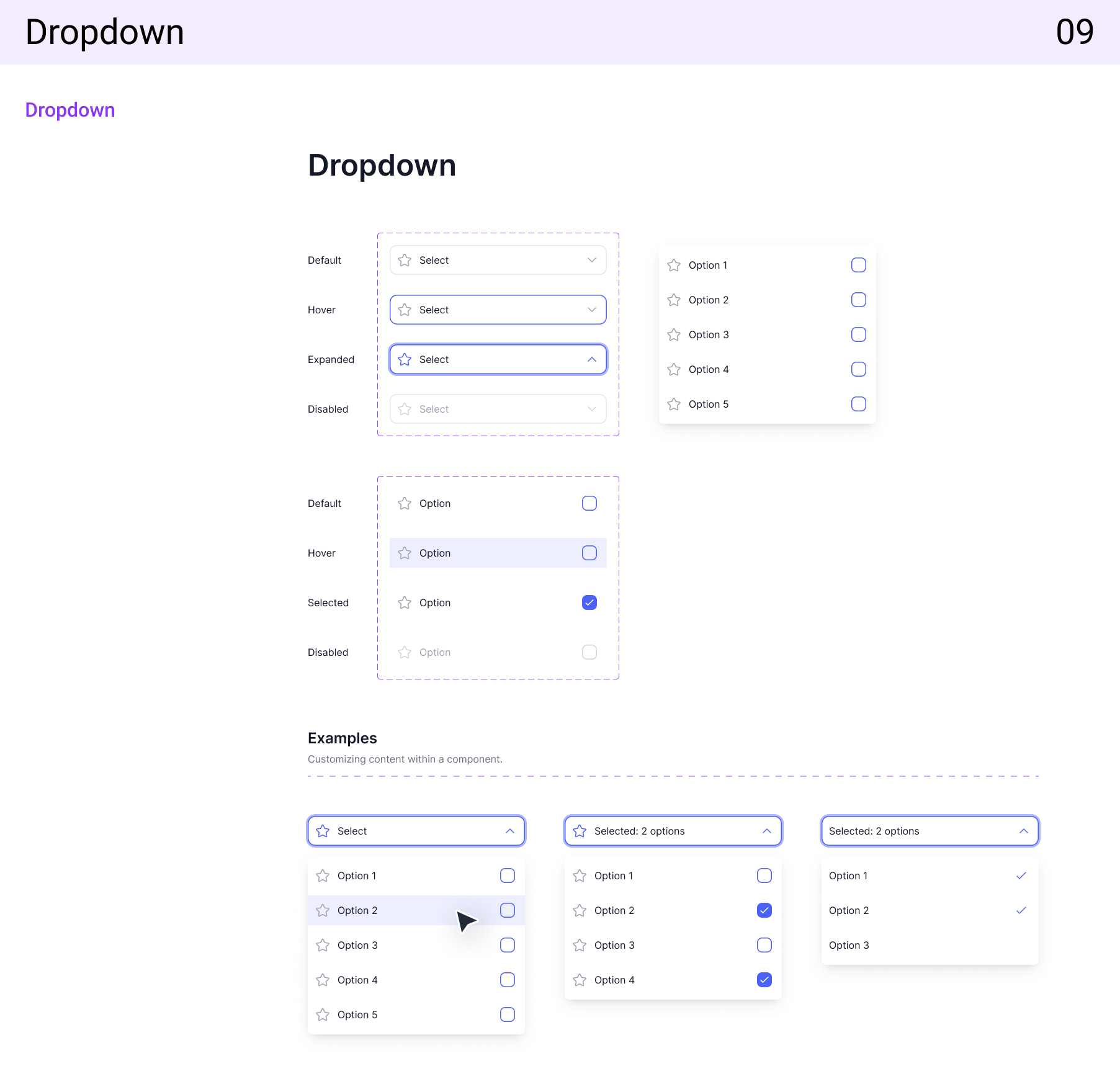
The dropdown component provides a structured and accessible way for users to select one or more options from a list. It includes variations such as single-select, multi-select, and searchable dropdowns. Each state—default, open, hover, and selected—is clearly defined to ensure smooth interaction. Consistent spacing, typography, and animation create a seamless and intuitive user experience across all product interfaces.
Calendar
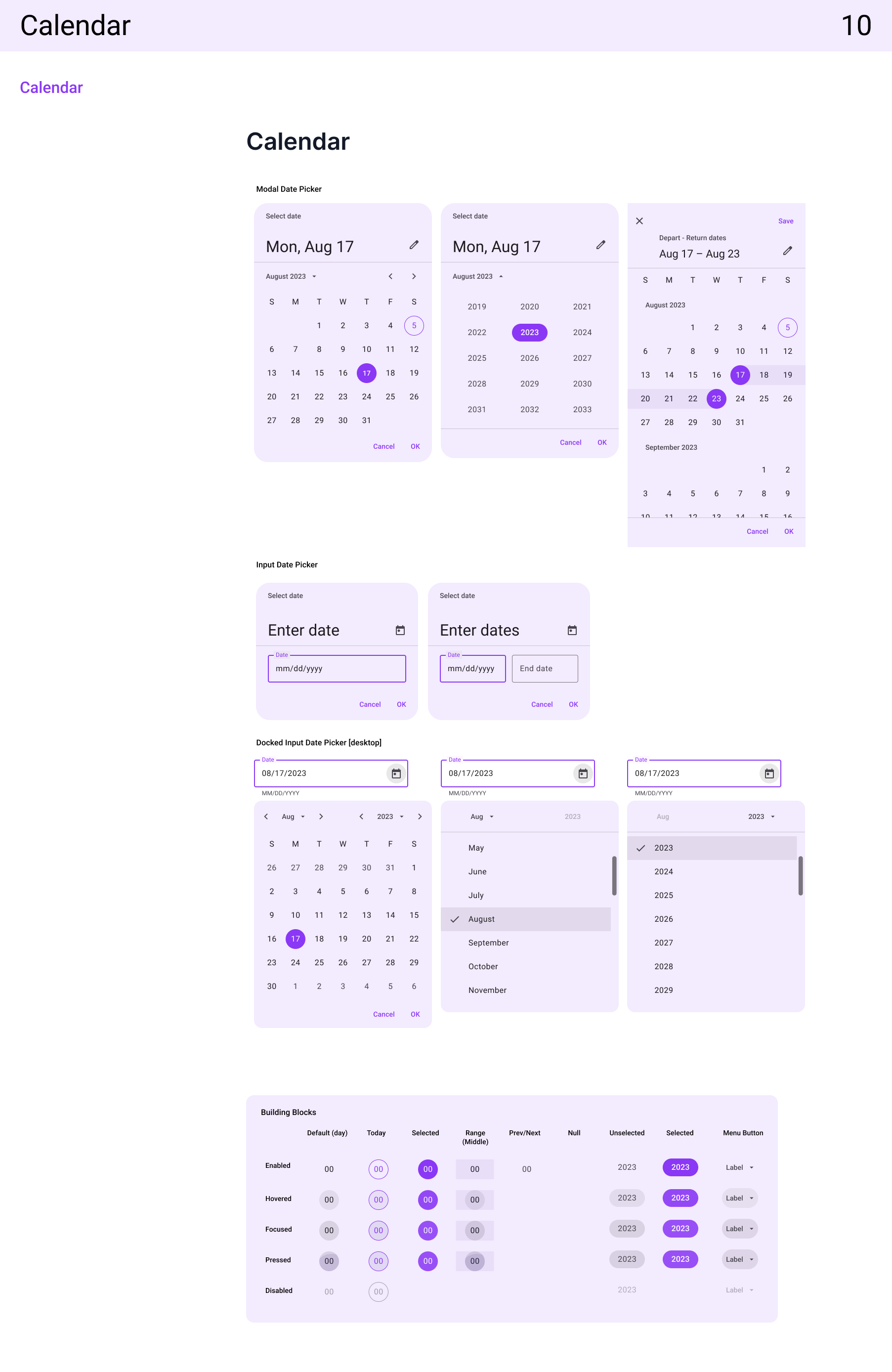
The calendar component enables users to view and select dates or date ranges efficiently. It follows a clean, grid-based layout with clear visual indicators for the current day, selected dates, and disabled states. The design ensures accessibility, readability, and consistency across light and dark themes, supporting use cases like scheduling, booking, and form inputs.
Navigations
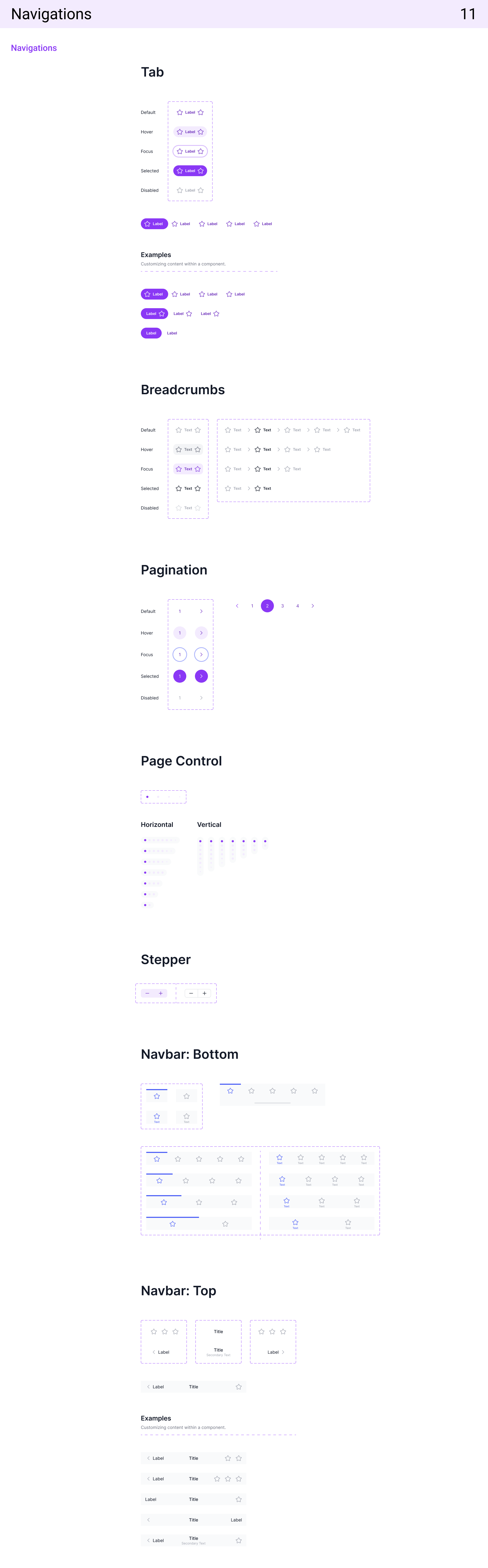
The navigation system defines how users move through the product seamlessly and intuitively. It includes components such as top bars, sidebars, tabs, and breadcrumbs—each designed for clarity, accessibility, and responsiveness. Consistent iconography, typography, and spacing help maintain orientation and provide a clear sense of hierarchy, ensuring users can easily find and access key sections across all devices.
Progress Indicator
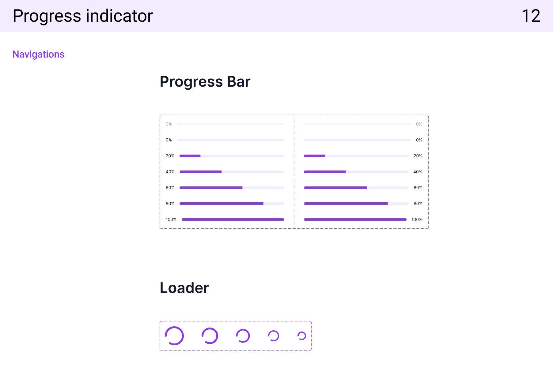
The progress indicator component visually represents the status of ongoing tasks or processes, helping users understand system activity and wait times. It includes linear and circular variations, each designed with smooth animation and clear color differentiation for active, completed, and pending states. The design ensures consistency across interfaces while enhancing feedback and user confidence during loading or submission processes.
Pop-up
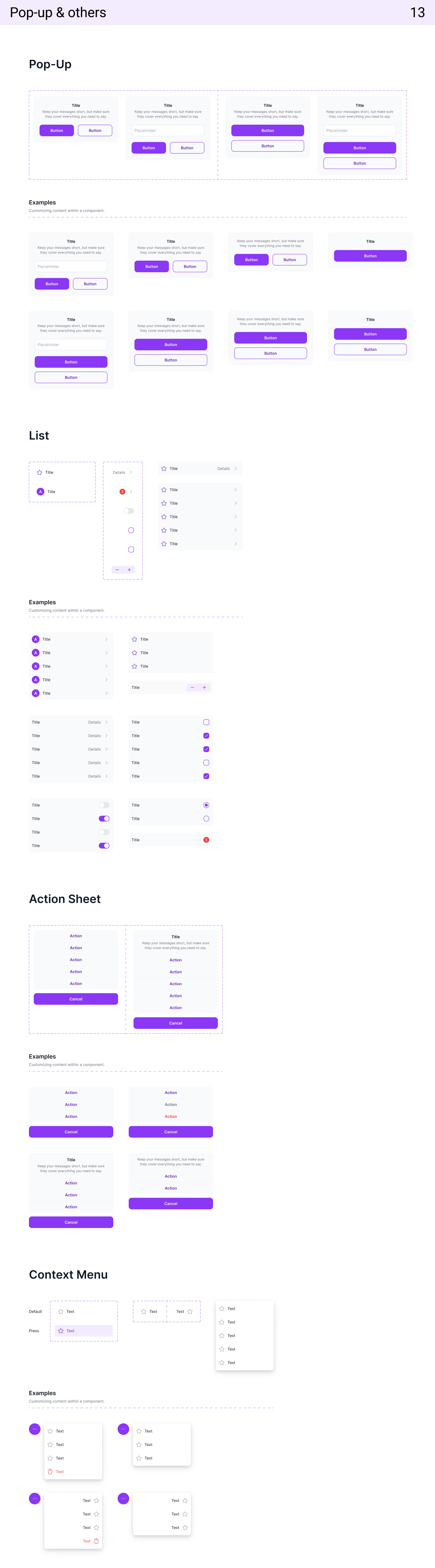
The pop-up component displays brief, focused content or actions without navigating away from the current screen. It’s used for confirmations, tooltips, or quick information. Pop-ups are designed with clear hierarchy, adequate spacing, and smooth transitions to maintain focus and prevent disruption to the user flow.
List
The list component organizes related information or items in a structured, scannable format. It supports variations such as single-line, multi-line, and interactive lists with icons or actions. Consistent spacing, typography, and divider use enhance readability and help users quickly identify key information.
Action Sheet
The action sheet presents users with a set of contextual options, typically emerging from the bottom of the screen on mobile. It uses clear grouping, visual hierarchy, and touch-friendly spacing to ensure ease of use and prevent accidental selections.
Others
Additional supporting components—such as tooltips, modals, toasts, and accordions—enhance interactivity and provide feedback or extended functionality. Each follows consistent design principles, accessibility standards, and motion guidelines to ensure a cohesive and user-friendly experience across the entire design system.

Ready to transform your ideas into stunning designs? Kindly reach out through my contact form and let's craft innovative solutions together for a memorable User Experience!

Step into the world of boundless creativity and leave your indelible footprint with us. Together, let's embark on a journey where imagination knows no limits, and possibility becomes reality